Key assumptions
Setting a baseline understanding
Without further consideration by the Louvre and their
priorities, I set some general assumptions about the
user and the website.
- People want to use this search feature for art search,
I am assuming that all their logistical search queries
(e.g ticket sales, planning your visit, and Louvre
activities) have been satisfied.
- Assuming that the Louvre wants users to search their
website for information, and that search is, from a
business side, advantageous for ticket sales.
-
The Louvre wants to create an experience that is both
delightful and engaging for art enthusiasts.
Initial observations // site audit
Searching for pitfalls
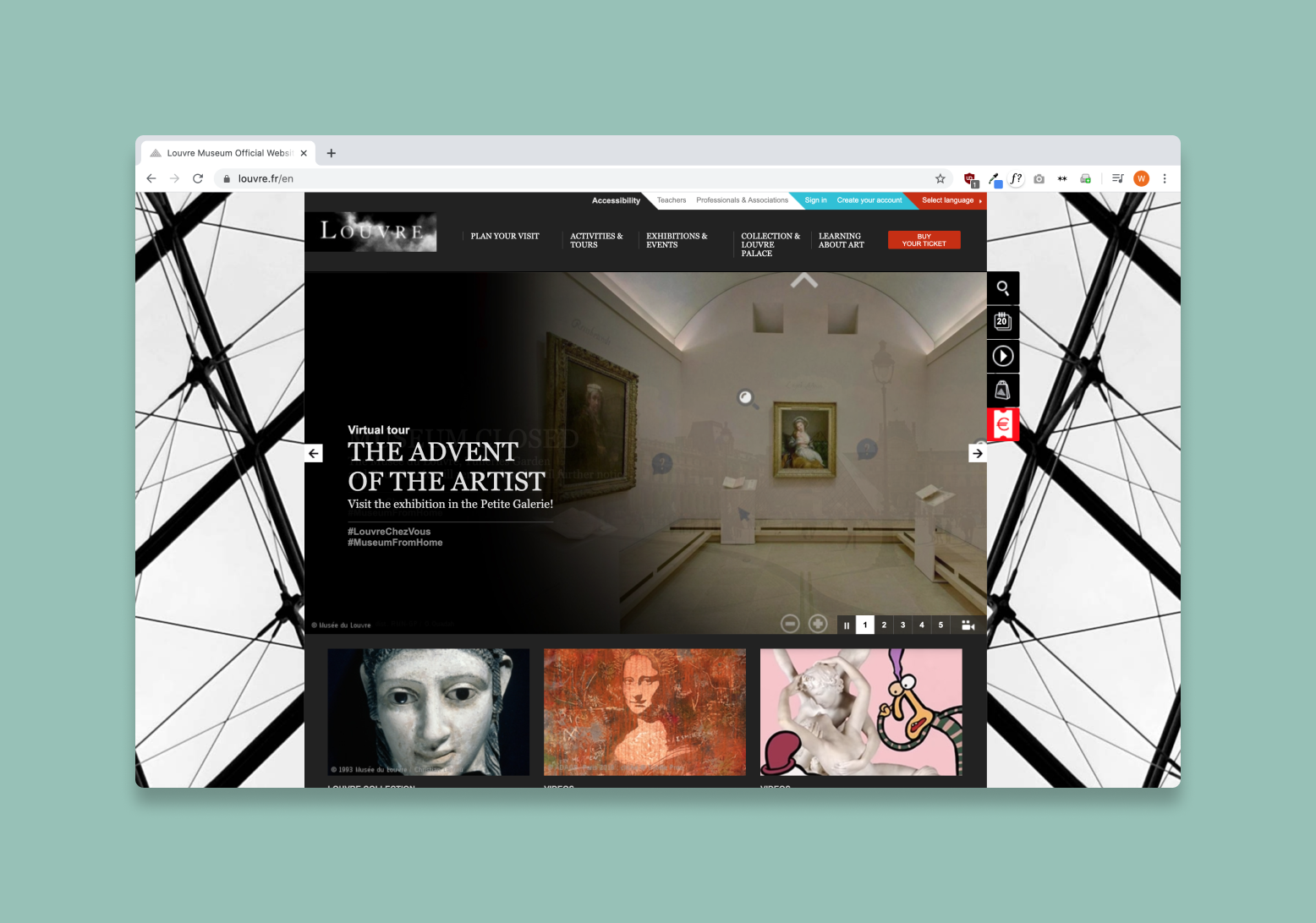
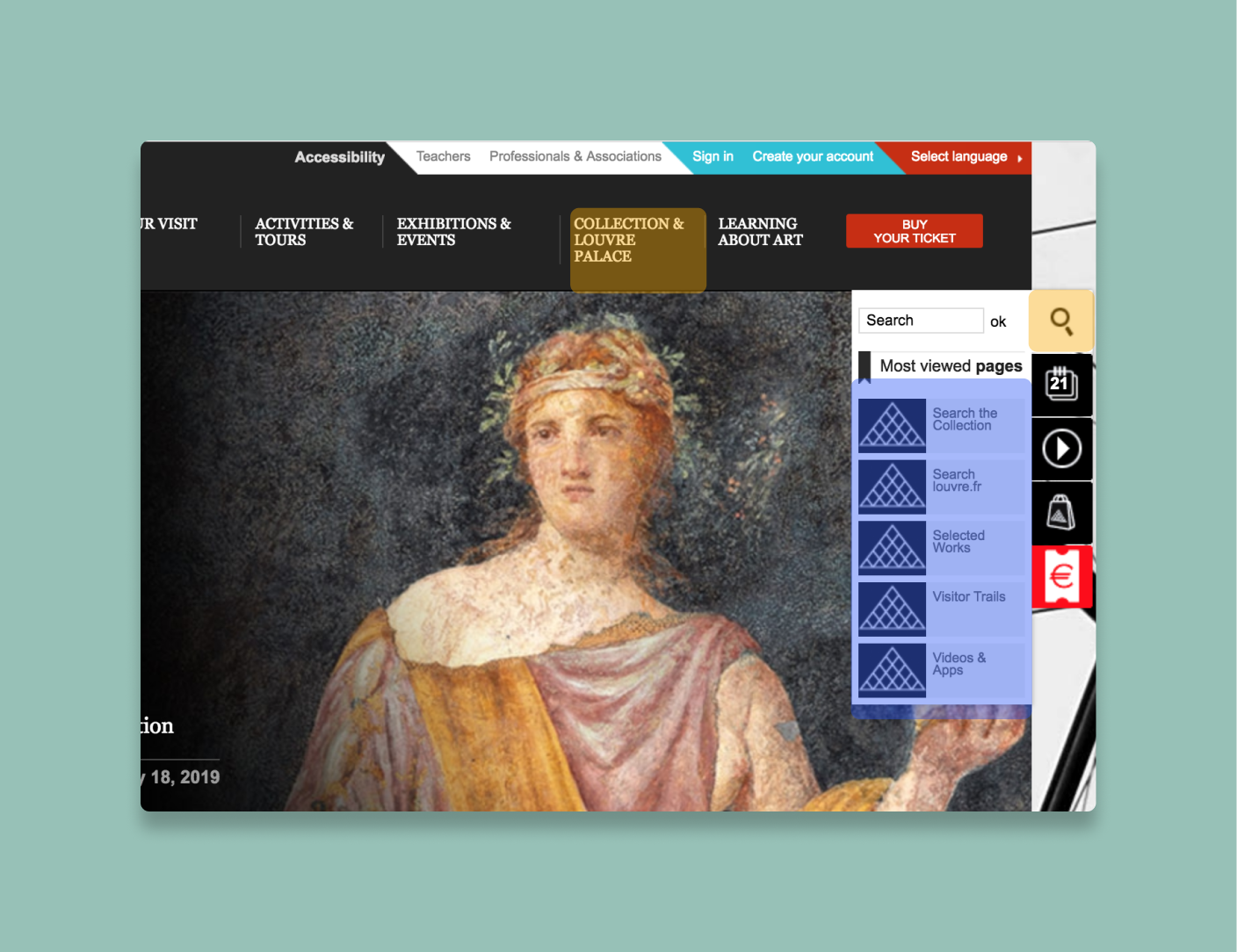
Having never been to the Louvre, or its website,
I decided to begin by taking a few notes on the
layout of the site, particularly focussing on hierarchy,
emphasized elements, and completing various search flows.
Right away, I felt cognitively overloaded from the information provided from the site.
There were an excessive use of tabs and menu elements, some functioning as
buttons, others as hover interactions. It seems the goal was to put everything
about the website on the front page. You could find information on donating money,
while simultaneously learning about which art pieces appeared in Beyonce and
Jay Z’s music video.
Initial observations // site audit
Scoping search for a range of expertise
I explored a few personas
based off of the different types of museum-goers to hone my design.
Persona 1
Caroline Fredin
Caroline just started to explore different mediums of art,
and would love to learn more about the different styles and
the inspirations behind the pieces. Currently, she only knows
a couple of big names of artists and artworks, but can not go
into specifics about the period or less known artists.
Persona 2
Alexander Maklouf
Has traveled to an extensive variety of museums from all over
the world, and is well versed in the different periods of art.
This user usually does extensive research before embarking on
trips to the museums. He usually plans out his entire experience,
and would love as much information as possible.
Could search become a immersive experience?
Initial Sketches primarily focussed on capturing an immersive
experience which emphasized visual components of art rather than
text. I intentionally kept these elements in the sketches clean in
order to prevent any sort of cognitive overload within the experience.
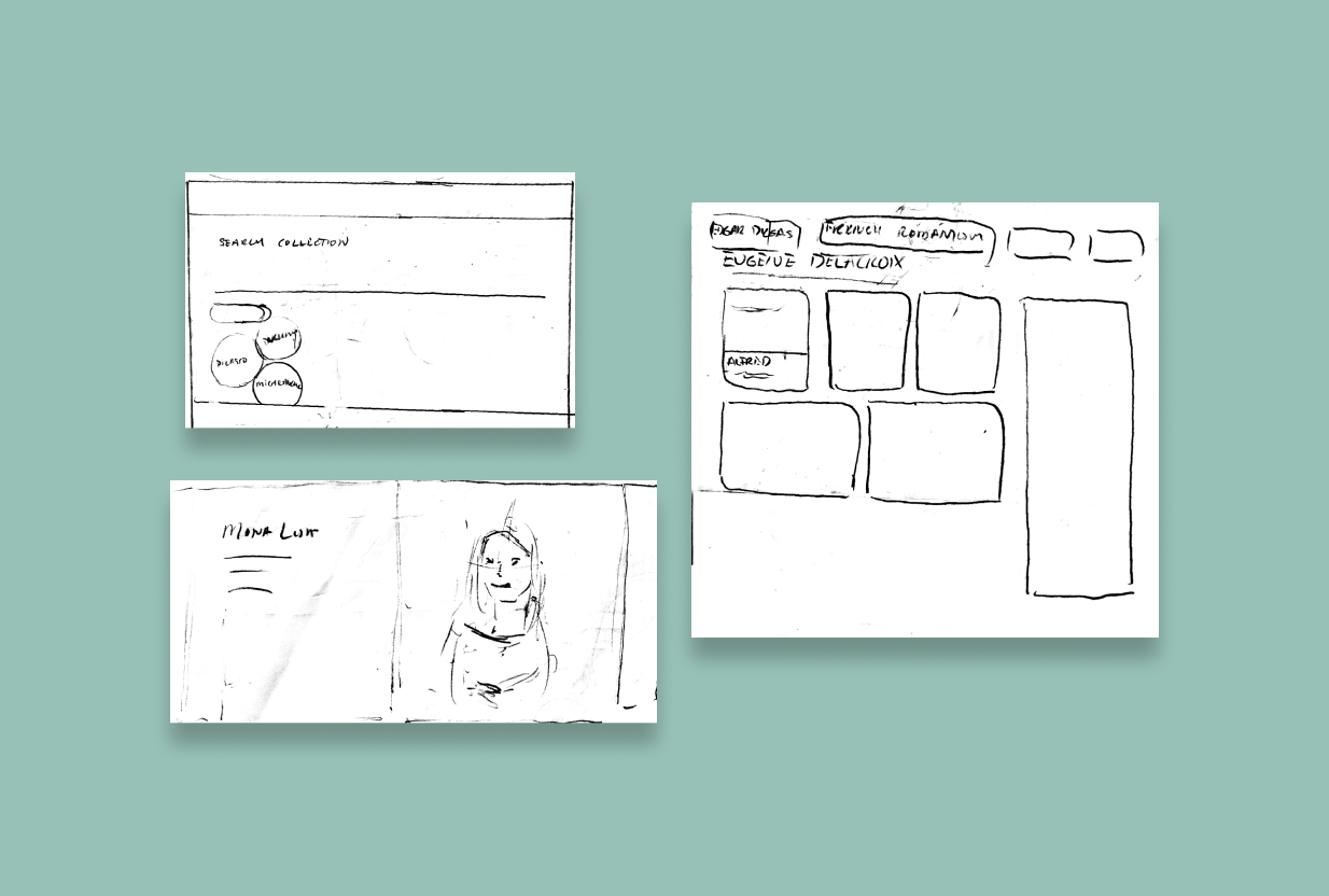
To address the confusions about which pages to use for search,
I designed a dedicated search page that could describe the limits
and materials available for search on each page. The color themes
are kept consistent throughout the search process. Rather than
flipping through 5 different search pages, this search page
encapsulates all into one.
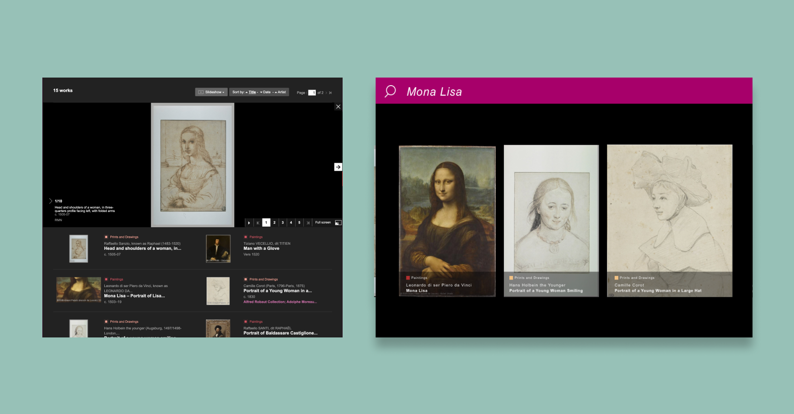
Loud visuals set the stage for an immersive experience,
while setting the context for what the user is searching for.
Users can toggle through the filter to understand which search
page they are using.
For search results, I focussed on creating an immersive experience
to discover new pieces of art. Prioritizing visuals over text,
I sized up the visuals and presented them in a carousel.
Key meta-details are still displayed with a smaller visual
footprint on the page.
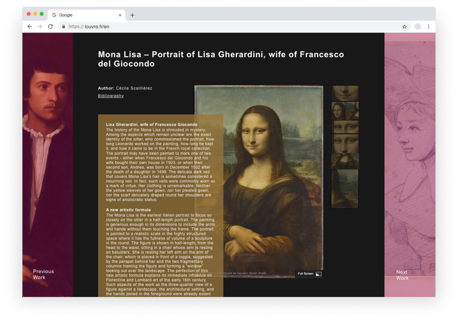
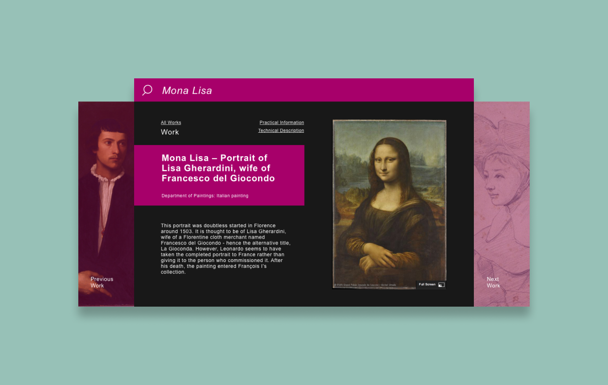
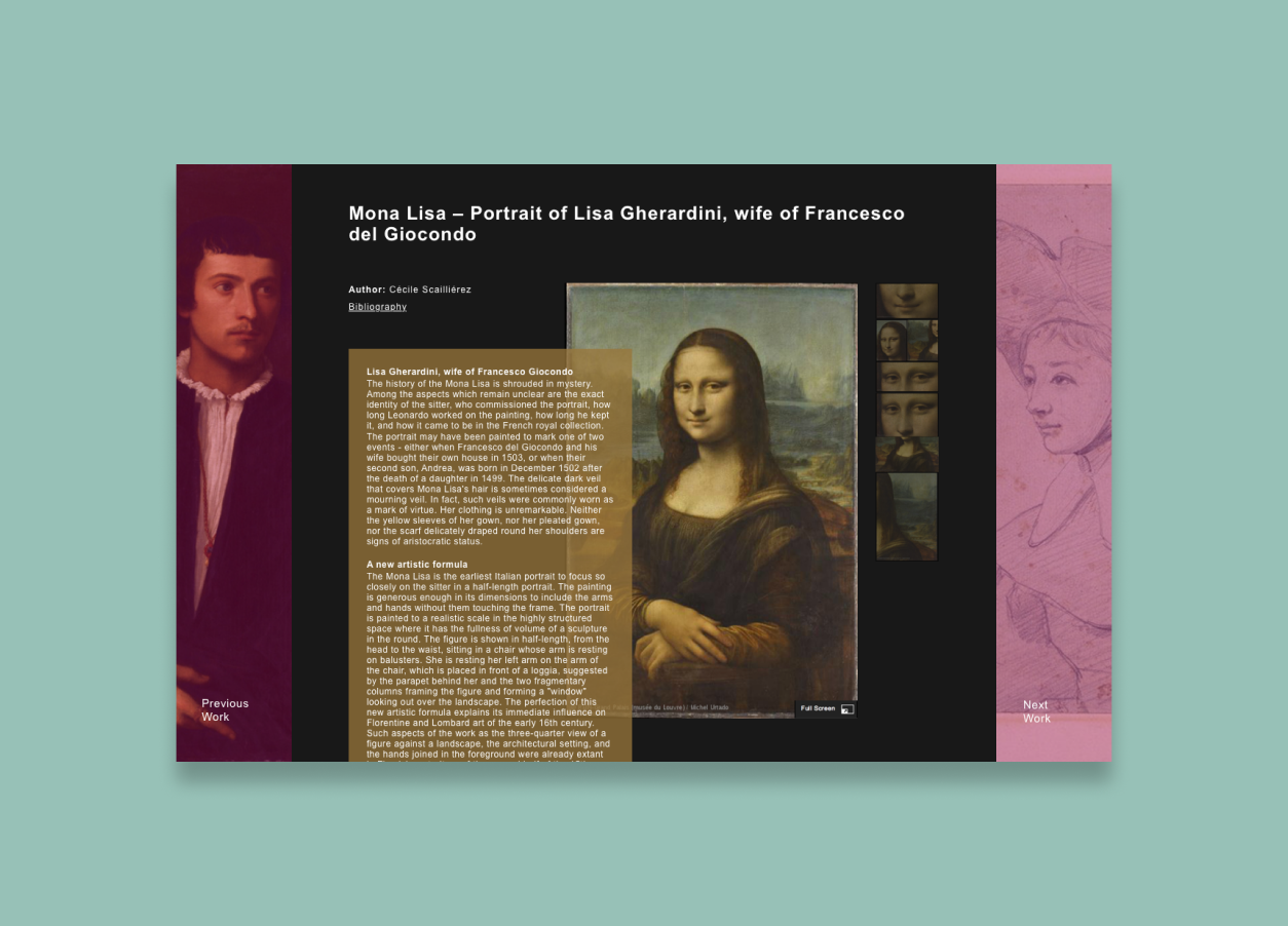
For the artworks page, the page initially displays key information
and then transitions to a page displaying the full article written
about the artwork and detailed images. Text is prevalent but does
not distract the reader from the overall focus of the art.
In addition, I included previous and next works to the design to
transition easily rom one artwork to the next.
Next Steps
Given more time, I would have liked to user test this wireframe to understand
both the strengths and shortcomings of this process. In addition, I would have
also liked to incoroporate more of the Louvre’s business focuses into the design
while crafting this search experience.